Create the Perfect Virtual Event Landing Page: A Step-by-Step Guide
Maximize Your Marketing ROI
Join 10,000 other marketers already getting the best tips on running engaging events that boost pipeline and create raving fans.
Creating a successful virtual event landing page is essential for driving signups and awareness around your event—which is what all B2B event marketers want!
But, how do we get there?
With the right steps and resources, crafting your own virtual event landing page can be as easy as 1, 2, 3…well, maybe there are a few more than three steps, but you get the idea!
In this article, we'll show you some awesome landing pages, explain why they work so well, and then discuss the steps that can land you among successful pages like the ones in our examples.
Even if you've got an event scheduled and coming up quick, don't fret! This guide can help get your landing page underway in no time.
Read on to discover:
- Why do virtual event landing pages matter?
- What are the benefits of virtual event landing pages?
- 3 amazing examples of virtual event landing pages
- Key elements of a successful virtual event landing page
- What are your options for creating a virtual event landing page?
- 9 steps to creating your own virtual event landing page
- Final note: Always keep the design simple and user-friendly!
- The Goldcast difference: an intuitive way to build successful landing pages
Why do virtual event landing pages matter?
At first glance, it might not be obvious why virtual event landing pages matter all that much. After all, isn't a landing page just another webpage? Isn't the real draw the actual event? Won't people sign up if they're interested, regardless of what the site looks like?
The short answer is: No. While you can, of course, throw some text about your event on a page and hope for the best, in today's competitive marketplace, it's not going to lead to the best results.
Compelling landing pages pique the interest of potential attendees and make them excited about your event. When people are energized about attending or learning more, they're more likely to talk to others and get them to sign up, too—think of it like free digital marketing!
Your landing page is essentially where people get a "first impression" of your event. Whether it's highlighting a standout speaker or a super fun activity during the event—or just setting standard expectations—this is your chance to shine, so take it!
And, while developing a good landing page takes thought, there's no need to reinvent the wheel. There are lots of strong event landing page examples out there that illustrate the must-have components; you can use these as a starting point when you're working out your own best practices.

What are the benefits of virtual event landing pages?
There are a million reasons why you should put the time and energy into creating solid event landing pages!
Here's just a handful of things that virtual event landing pages can do:
- Boost conversion rates
- Convey critical information so everyone shows up prepared
- Help spread awareness about your event
- Generate leads for your company
- Grow your email list
- Provide brand consistency and continuity
- Showcase your speakers
For event organizers, having an optimized, easy-to-navigate event or conference landing page is of paramount importance—and Goldcast's intuitive page builder makes it easier than ever. As you'll see in some of the following examples, our platform makes it easy to create beautiful, high-converting landing pages, while staying on brand!
4 amazing examples of virtual event landing pages
Sometimes nothing gets the wheels turning like some good old, real-world examples from past events. Here are four landing pages we really like!
Goldcast's Rock Your Funnel series
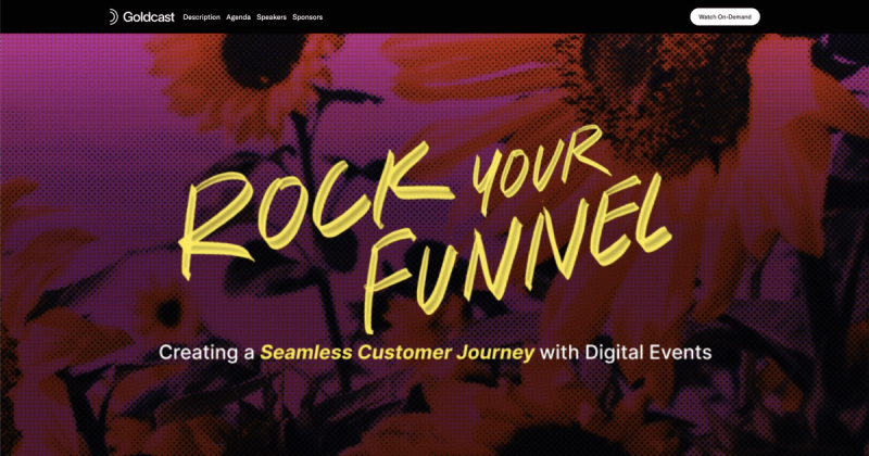
In the interest of keeping things humble, we'll kick things off with one of our own events, created and powered by the Goldcast platform. 😉
The moody, colorful floral design you see on the page carried throughout the entire series. We had speakers and panelists download the image and use it as a background to give all of the talks a cohesive feel!
For the rest of the page, we crafted on-brand copy that played up the "rock" theme of the series, outlined an entire agenda for all of the dates, and gave folks a sneak peek of a few things they'd learn by signing up. At the very bottom of the page, visitors could also see who sponsored the event.
And, now that the event is over, the registration link has become a place to watch the recording on-demand for anyone who missed it.
SnapLogic's SnapLabs Corner Update
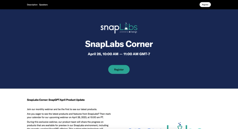
This event landing page is subtle but effective, drawing readers to the registration button right under the title of the event. Just below that, we get a sense of what this event is all about: learning more about SnapLabs' latest products, including their newest SnapGPT offering. No burying the lede here!
Then, SnapLogics gives us a few more teasers about the event, displays their logo for brand recognition, and tiles out the speaker lineup so we can see which company experts will be at the event.
This is a great example of how an event landing page design can be minimal but still get all of the information across—including the value prop!—and encourage people to attend.
Hired and G-Research webinar
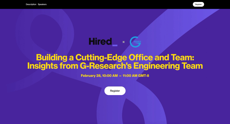
Hired teamed up with G-Research to host an event called "Building a Cutting-Edge Office and Team: Insights from G-Research's Engineering Team." The landing page leads with the title of the event, letting people know that it's a collaborative webinar. They also list the date, time, and how people can sign up.
Directly after that info comes a short description enticing folks to sign up, followed by a speaker roundup, complete with LinkedIn profiles so people can browse and learn more about the expert panel. The entire page is succinct, easy to read, and makes a lasting impression.
Pentera's Xposure Summit
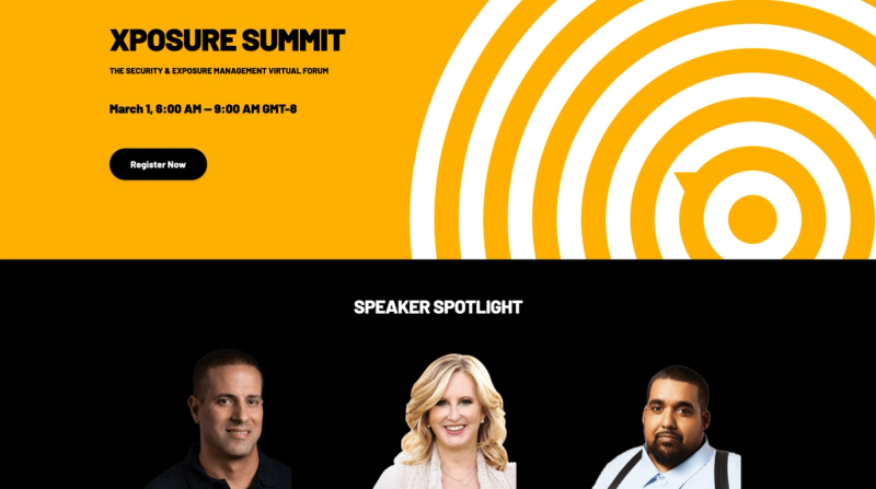
Right away, this page draws you in with the bold yellow and black contrasting colors, the circular design, and the featured speaker spotlight. The event details are easy to locate, and you can scroll down for more information, including the full agenda. They even come right out and tell you exactly why you should attend!
Within the agenda, visitors to the page can filter by different tracks, making it easy to find relevant information and decide whether you want to attend. As we've seen with the other example pages, the sign-up form is simple and straightforward, making it a cinch to register for the event.
Key elements of a successful virtual event landing page
An important thing to note about all of the examples we just talked about is that they're all on brand for that specific company. When it comes to designing your own virtual event landing page, it's fine to draw from other examples but you want to make sure you're not throwing people off.
If your brand usually opts for bold color schemes, striking visuals, and strong fonts, for example, you don't want to completely change that up—unless it makes sense for that specific event and that's something that attendees will pick up on.
With that in mind, here are some elements that make for a great virtual event landing page. As you read, think back to the examples and see if you can recall how each landing page incorporated these things.
Branded and engaging design elements
We're listing this one first because, as we just touched on, branding is so important! Ideally, your landing page platform will allow you to infuse your own brand voice and personality into your event pages.
Think about the fonts, colors, graphics, tone, and even video content you will use and make sure they're aligned with who your company is in your day-to-day marketing efforts. This will build brand awareness and trust among your audience because they know you're consistent.
Compelling headline and subheadings
Your copy should be eye-catching and informative. The initial header should convey exactly what your event is about, while subheadlines can give a bit more insight into the value proposition. The copy throughout the rest of the page can build from there, giving people more reasons to attend and garnering excitement about activities or incentives associated with the event.
Call-to-Action (CTA) buttons and registration forms
You don't want anyone to end up on your page confused about what you want them to do next. The CTA and registration forms should be crystal clear and convey the message: We're glad you're here, and we want you to sign up now!
Be sure that your CTA button stands out from the page. Whether you choose a bright color or a contrasting shape, make sure people's eyes naturally gravitate toward the button.
Make it easy for people to know what you expect of them and to sign up. Use simple registration forms that don't require tons of fields from your registrants; the less information they have to fill out, the higher the chance they'll actually complete the form!
Want more? Check out 15 of the best landing page examples now!
Important event details, agenda, and schedule
Again, no reason to bury the lede! Let people know what will be going on during your upcoming event and why it's worth attending. Include all key information about the event that they need to know at this stage.
This includes dates, times, and location (if it's a hybrid event), as well as speakers, who should attend, and bullet points about what they can expect. And if the event costs money, be transparent about pricing and how people can purchase tickets.
Clearly laying out event information ahead of time helps potential event attendees make informed decisions quickly and easily and boosts the chances that you attract more of your target audience to the event.
Speaker details
As you saw with the example pages, including images and LinkedIn profile pages for your speakers is a great way to let people know who will be talking and pre-introduce your experts. Seeing faces on the page also adds a human element to the landing page, which is always a good thing!
What are your options for creating a virtual event landing page?
Okay, so now we know why virtual event landing pages matter and what it takes to make a great one!
But, how do we actually create it?
Well, you've got three options, and each comes with its own set of pros and cons.
First, you could custom build out your own page. If you do this, you've got the most control over the results, but you'll also spend the most time and money to get there. Custom pages require an in-depth understanding of web development tools, which most marketers don't have. And, quite frankly, custom coding usually isn't necessary for an effective landing page.
Your second option is to use one of the many page builders out there. These may seem simple on their face, but we've found they're often quite clunky. The other major disadvantage here is that the page will live separately from your overall events management processes and system, adding just one more platform for you to manage.
The third (and, in our opinion, best!) option is to use Goldcast's page builder. Because it's designed specifically for B2B event marketers, we truly think it's the bee's knees. It makes building your next event landing page easy, and it's totally integrated with all of our other analytics and management tools.
Our intuitive drag-and-drop interface allows you to build on-brand, jaw-dropping event landing pages with just a few easy clicks. No coding required—ever. Plus, it's an all-in-one event registration and landing page solution that makes the entire process easy for you.
Beyond that, we made sure to include features that are specifically for virtual events, like customizable video backgrounds that will grab people's attention right away. You can use countdown timers to create a sense of urgency and FOMO around signing up, add FAQ sections, incorporate social media links, include testimonials for social proof, and so much more.
With all of these powerful features at your fingertips, you're well on your way to high-converting event landing pages. People will be captivated by your page and motivated to take action and sign up right away!
9 steps to creating the best landing page for your virtual event
Next, we'll cover the nine essential steps to creating a high-converting virtual event landing page that will captivate your audience and get them ready for your next event.
Here is a comprehensive breakdown of each step involved in creating your successful virtual event landing page. Let's get started!
Step 1: Define your event objectives and target audience
The first step is to know what you're hoping to achieve and who you want to come to your event. That information will play the biggest part in driving what kind of page you design and what information you include.
For example, if you want to attract the day-to-day end users of a product, you can tailor the objectives and messaging to speak directly to that audience versus, say, the senior leadership of a company.
Step 2: Select the right virtual event platform
Now, it's time to select the virtual event platform you'll use to create your page. While you certainly have options, we've already broken down why we think Goldcast is the best choice! We believe you'll find our user-friendly interface the best out there.
👀Seeing is Believing: Get a personalized Goldcast demo to see our event platform in action!
Step 3: Choose an effective landing page builder
Not only does Goldcast's page builder allow you to create beautiful landing pages for any type of event, but it also gives you a central hub to organize all of your pages. You can even create landing page templates to make it easier for yourself down the road!
Step 4: Design the layout and structure of your landing page
Goldcast has the functionality to allow you to build event registration landing page layouts with prebuilt or custom blocks, depending on your needs. Remember that when you're dreaming up your layout, you want to have space for all of the components we talked about earlier, like a compelling headline, on-brand images, and an event description.
Step 5: Craft compelling copy and headlines
Brainstorm the words that you'll slide into each part of your event website page. Remember that your copy should be informative and concise but still relatable and fun (or whatever tone is on brand for you!). Be sure that you have space for all of the key details that people need to know, like headings, presenter bios and headshots, and the agenda for the event.
Step 6: Use corporate and event branded design elements
If you've got special design elements for this event or series, let them shine on your landing page! If not, lean on your trusted brand kit to provide images or logos you can use for this event. Refer back to our event landing page examples for ways to do this without overwhelming the content of the page.
Step 7: Integrate registration forms and Call-to-Action (CTA) buttons
Be sure that all necessary forms and buttons are integrated. This is essential for registration and lead generation! If you aren't getting the info people are providing you, you won't get very far. Again, be sure that your forms and CTAs are displayed prominently on the page and that no one has to hunt to find them.
If your page is long and people will be scrolling to find more information, feel free to add more than one CTA so that people are never far from one.
Step 8: Optimize for SEO and mobile devices
If you'll be using SEO keywords, this is the time to check to be sure your page is optimized for those. It's also a great time to be sure your page renders well on mobile devices. If you're using Goldcast, the good news is that this is automatic! Our registration page builder is optimized for all devices, including mobile.
Step 9: Test and optimize your landing page
You're almost done! The final step is to test things out and continue optimizing if necessary. Have others on the team review the page, visit your landing page on different devices, and make sure everything is working according to plan. You want to catch any potential errors before you send your landing page out into the world!

Final note: Always keep the design simple and user-friendly!
We have covered a lot of ground, and you may be feeling like there's a lot of moving parts to keep track of. This feels like a good time to point out that, as with many things in life, simplicity often works best.
At the end of the day, we want our landing pages to accomplish everything we've talked about, while still being as user-friendly as possible. This means that even if you've got 15 amazing animations you want to use, they probably shouldn't all go on your event homepage, as that will be a lot for your visitors to take in.
Crafting an inviting, yet organized, landing page takes skill and practice, but you're in a great place to start, having learned from our examples. With the right approach, you'll be developing visually appealing, easy-to-understand layouts that get more and more people to sign up for your events!
The Goldcast difference: an intuitive way to build successful landing pages
We've said it before, and we'll say it again: Goldcast's page builder is the most accessible, effective option out there. We use it ourselves to simplify the customization process and publish stunning, engaging pages that promote our virtual events and convert people into attendees!

Transform Your Video Marketing with AI
Stay In Touch
Platform
Resources
Company
© 2026 Copyright Goldcast, Inc. All rights reserved.
YOUR PRIVACY CHOICES



 Upcoming Events
 Event Series
 On-Demand Events